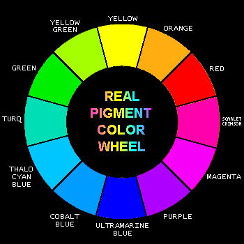
We all learn in elementary school that the colors of the rainbow are red, orange, yellow, green, blue, and purple. Red, blue, and yellow are the primary colors and orange, green, and purple are the secondary colors. However, we learned these past few weeks that light’s primary colors are red, blue, and green. What gives?

Well, back in the day, Isaac Newton split sunlight into a rainbow using a prism. He labeled the colors he saw as “red, orange, yellow, green, blue, indigo, and violet.” That’s where our other common elementary school rainbow (ROYGBIV) comes from. Why seven colors? Newton was really religious/superstitious, and he came in with the preconceived notion that seven was a holy number, so there MUST be seven colors present. Preconceptions aren’t very good form for a scientist, but given all his contributions to science, we’ll forgive him.

Indigo doesn’t come up nearly as often these days. If you google why indigo isn’t in the rainbow, you’ll find a lot of people who are very upset that indigo no longer exists, and equally upset people claiming it never existed at all. Of all the things to be mad about, haha… Let’s be clear that indigo DOES exist – it just isn’t considered a primary or secondary color in any field these days (probably b/c it’s too difficult to distinguish from blue and purple), so no one cares much about it.
So, indigo aside. Why do artists (and elementary schools everywhere) say the primary colors are red, blue, and yellow when scientists say they’re red, blue, and green?
The answer starts with the difference between additive and subtractive color mixing. You can add red, green, and blue light together to get any colors of light. But pigments, like ink and paint, absorb light – they subtract light instead of adding it. That means a different system is needed. However, that system isn’t red, yellow, and blue. It’s magenta, yellow, and cyan!

First, it’s worth noting that light comes in a spectrum, not a wheel. The colors between red and blue can only be obtained by red and blue light mixing. So, magenta pigments are reflecting red and blue light (just like yellow reflects green and red, and cyan reflects blue and green). Now, when these three “primary” colors are mixed, you can get red, blue, green, and any other color you want. This is why printers use CMYK ink (cyan, magenta, yellow, and black).
So what does any of this have to with red, blue, and yellow?
The fact of the matter is that red, blue, and yellow are not proper primary colors of either subtractive or additive light. ROYGBIV (with I or without) was likely conceived before Newton or any other scientific study when some artists noticed you could produce most other colors using red, yellow, and blue. Their guess wasn’t too far off – red is pretty close to magenta, and blue is pretty close to cyan. So red, yellow, blue is really the older, erroneous version of magenta, yellow, and cyan. The rainbow of primary and secondary colors really ought to be red, yellow, green, cyan, blue, and magenta.
Then why do we keep using the red, orange, yellow, green, blue, purple system? I have two theories. One: Habit. It’s been around a lot longer, so it’s easier to just stick with it. Two: There’s this thing in color theory called “split complementary colors.” Complementary colors are those that are opposite on the color wheel. People like them because they are very high contrast together. A split complementary color scheme doesn’t use the exact opposites, but instead uses colors just to the left and right of the opposite color. This way there is still a high level of contrast, but not quite as high, making the color scheme appealing and easier on the eyes.
My working theory is that the artist’s color wheel is just off enough from the subtractive color wheel that an artist’s complements are actually split complements, and are therefore more appealing for us to look at.

One of the more popular artist’s complement pairs is blue and orange (lots of sports teams use this combo). You can see here that blue and orange would be split complements on the “real” color wheel. The funny thing is that blue and yellow, which are “real” complements, are considered split complements by artists. This combination is also extremely popular (lots of other sports teams use these colors).
In short, I suspect that we find the complements/split complements on both color wheels appealing because of a combination of physics and psychology. The “real” complements are actually opposite of each other, but we’re used to seeing ROYGBIV, so those color relationships have been ingrained in us as well. As in Prof. Conway’s lecture, when it comes to color, it seems our brain’s perception matters just as much as the actual physics occurring…
Hope everyone enjoys all these colorful diagrams as much as I do 🙂

One Response to ROYGBIV?