Dressgate

Dressgate 2015: What color is that dress?! Is it blue and black or yellow and gold?

As we discussed in class, building off of Professor Conway’s lecture earlier in the semester just after the dress controversy, color vision is affected by a number of factors. Our eyes and the cameras that we use (cell phones, etc.) are engineered to not trick us. We have trained ourselves to use all the information available to us to decide what color things are. Similarly, we remember color-object pairs that we see frequently.

As Professor Conway explained, color vision is just our eyes absorbing the visible light part of the electromagnetic spectrum. The light we receive has different wavelengths which corresponds to our perception of different colors. In perceiving color, our eyes are actually looking at all of the information- we look at the light source, evaluate what shade it seems to be, the object and anything in its foreground or background. In the case of the dress, the light source is varied and the foreground and background are a mix of shadowy and too bright so our eyes get confused. As we saw clearly in Professor Conway’s presentation especially through the Albers piece with the two X’s our perception of color really depends on the surroundings. In Albers’ work, the X on the purple background appears to be a totally different color than the X on the yellow background but in reality, they are the same color. In this instance, our eyes and brains are adding the background into the equation, which confuses us. Similarly, when the dress went viral, people formed very strong opinions on two different camps- blue and black or white and gold. These people were all looking at the same dress but considered the other information in the photograph differently.

In discussing the dress, it is also important to acknowledge the way in which the dress was presented to viewers. Were they shown the dress and asked what colors they thought it was or were they asked if they saw black and blue or white and gold? That is a very crucial distinction to make. In the first instance, viewers have the full range of colors in their imaginations available to them whereas in the second,

Check out the link below for an image of the dress (in case you haven’t seen it…which would be impressive because it was EVERYWHERE)
http://www.telegraph.co.uk/news/science/science-news/11440142/Dressgate-the-science-of-why-THAT-blue-dress-looks-white.html

Posted in Uncategorized | Leave a comment

Optical Illusions Revealed

http://brainden.com/color-illusions.htm

After our discussion with Prof. Bevil Conway in class about the various optical illusions like that of the famous dress and the Rubik’s cube, I was intrigued and wanted to experience some more optical illusions firsthand. I came across a very interesting phenomenon, that combines both light and motion. It is the phenomenon of the Lilac Chaser, more scientifically known as Troxler’s fading. In the link attached above, if you concentrate on the black cross at the center of the circle long enough, the moving lilac dots turns green.

The effect results from our visual neurons switching off their awareness of things that aren’t changing, and increasing their perception of things that are. The lilac dots stays still while the absence of the dots moves. Thus, after a brief figuring-out period, the visual system transitions to focusing on only the moving blank dots which it turns green because of a second illusion at play here and lets the immobile lilac dots fade. Further, these is another optical illusion in it as well. As for the other optical illusion, the blank dot turns minty green because your retina has been over saturated with the lilac colored dots. When the lilac is removed from the spots, you see its complementary color (minty green) instead, which is composed of white light minus the lilac.

It was intriguing how my understanding of these optical illusions had transformed as I was now better able to understand and explain the underlying scientific phenomenon for what I was observing. 

Posted in Uncategorized | 2 Comments

Keith Haring Bright colors and black lines

Last week’s discussion on color and how we detect it really interested me. I was especially interested on the artistic side of color since I am especially drawn to artwork that contains really vibrant colors. Professor Conway’s discussion of Matisse and his use of white spaces to maintain the integrity of the colors that he used to paint with.

This brought me to the artwork of Keith Haring who used extremely vibrant colors in his works. Haring began his art career as a street artist and used bold colors and sharp eye to call attention to his works. I felt that his works were especially relevant to last week’s class due to his usage of  bold black lines that serve to separate and highlight the colors he uses in his works, much like Matisse’s use of white space to preserve color integrity.

Posted in Uncategorized | 2 Comments

Bringing Color to Intelligence

Daniel Tammet is considered autistic.  While some of his social skills are said to be compromised by this ‘condition,’ his cognitive and linguistic skills have been able to develop to a very complex system.  He tells us that his mind works in visual arts, showing pictures, images and colors that represent numbers; performing complex mathematical equations and retaining unbelievable amounts of information.

To prove this intellectual phenomenon, Daniel accepted a challenge to remember 22,500 decimal places of pi and be tested in a live environment.  For nearly six hours, Daniel was able to spew off the decimal places of pi without error.  He describes his performance as having a certain association with each number and their correlated ‘experiences.’  By this, he means his brain ‘sees’ every number as a deeply rooted image, sound, or color.  Scientists have found that this is called synesthesia, when two parts of the brain are connected that would not normally have interacted.  This ‘synesthetic landscape’ is how he was able to remember so many decimals of pi – visualizing the image of pi and then recalling it, number by number.

            This is a very interesting fusion of color and intelligence, where we see that color has a very distinct purpose in our lives and the functions of our brain.  Perhaps as greater experiments are conducted and individuals with these capabilities are studied, we will learn how to foster this color-intelligence and access a whole new level of understanding.

To learn more, please visit the website below where you can watch a documentary on Daniel and his journey through the media and the studies which accompanied.

http://ynaija.com/meet-the-man-with-the-incredible-brain-he-sees-visual-numbers-smells-and-tastes-colours-watch/

Posted in Uncategorized | Leave a comment

Apple of my Short Sighted Eye

After our discussion in class about the dynamics of the eye and how they are able to see color, was interested in learning more about how eyes work. I learned that eyes can be different sizes and this leads to short and long sightedness. When eyes are too short, light goes through the lens and focuses behind the retina. This means that they are long sighted and have to focus more than they should do, especially on things that are close up. When eyes are too long, light goes through the lens and focuses in front of the retina. This means that they are short sighted and that they cannot see things clearly if they are far away. Normally light is focussed by the lens to form a sharp image on the retina. Long sightedness and short sightedness can run in families and be genetically passed on. Long sightedness and short sightedness can be corrected by glasses or contact lenses. They act as an extra lens, besides the lens in the eye, that focus the light correctly to the retina. The many parts of the eye work together to allow us to correctly see and observe the world around us.

Posted in Uncategorized | Leave a comment

Chromatic Induction: Is this why our paintings look weird?

I’ve always wanted to make art, but in a way have always believed I couldn’t. That I lacked the innate talent to ever create a masterpiece. As I grew older I began to understand there was a certain level of obsession inherent in art creation. You had to LOVE it. Really spend time with it.

You had to devote yourself to it.

I wasn’t going to do that.

This class, however, has made me devote a considerable amount of time to art creation and last week, when I turned in my midterm project, I was severely disappointed by the way it appeared at the end. It was nothing like I’d imagined in my mind. The colors looked strange and I couldn’t figure out why.
Reading Bevil’s piece, “Doing Science, Making Art”, made me realize my mistake. Chromatic induction, or as explained better by Bevil’s introduction of a conversation Cezanne had with his dealer, is the phenomena of color appearing slightly off when surrounded by a different color. Bevil writes of a watercolor piece he created where he left space around each color in order to keep the colors from changing when influenced by the color around them. He writes he kept some white around each color- “So the color of each mark as it appears in the final picture is similar to the color of the mark as it was made during the painting’s development”.

This makes a ton of sense, and I wish I’d been aware of the phenomena earlier.

For this week, I might redo my midterm project. Just to see if it looks any better.

Posted in Uncategorized | 1 Comment

Photodegradation

Photodegradation is when energy from the sun destroys the chemical composition of substances. When pigments go through photodegradation, they are bleached.

Photons are particles of light. When they are absorbed in the wavelength range of 290-700 (at surface of the earth, they change the structure of molecules. Specifically, the energy the photon has is given to the electrons inside the molecules of pigments. This excess energy brings the molecule from a ground state to an excited state. At the excited state, the molecule is not stable. Due to the instability of the molecule, it is subject to decompose in the presence of water (hydrolize) or oxygen (oxidize). In addition, molecules can decompose into high energy fragments that react with molecules around them (photolysis).

In pigments, photodegradation is bad because the pigments lose their color. But in other situations photodegradation can be important because it can deactivate and remove pollutants from the environment. Ways to prevent photodegredation of pigments is to limit oxygen’s access to the dye (think: antioxidants).

Photodegradation also is important when it comes to NSAIDs in the environment. NSAIDs such as ibuprofen and naproxen have been found in surface waters and some view this as a potential environmental crisis. In sunlight, the chemicals of NSAIDs decompose in the water. But the effects of this decomposition are not really known.

The environmental impact of NSAIDs can be limited in the following ways:

“California Sate Board of Pharmacy recommends that medication be properly disposed of by following these five steps: 1. Keep medicine in its original child-resistant container. 2. Place some water into the solid medication, such as pills or capsules. Add a nontoxic absorbent such as saw dust, kitty litter, charcoal, or powdered spices. 3. Close and seal the container lids tightly with tape. 4. Place medicine containers in durable packaging that does not show what’s inside. 5. Place in trash close to garbage pickup time.”

Posted in Uncategorized | Leave a comment

Animals and Color Perception

It was really interesting to learn about how color vision is so different in shrimps! As Professor Conway explained in class last week, human color perception is the result of lights absorbed in three different cone photoreceptors in the retina. These photoreceptors are each sensitive to different wavelengths of light. However, although these cones enable us to see millions of different combinations of light, they do not let us distinguish between a color as it appears in natural light (e.g. the yellow in the visible spectrum) and the same color as it appears as a mixture of two colors (e.g. yellow as a mixture of red and green). Thus it as really interesting to learn that although shrimps have 12 different cones, they can actually perceive fewer colors than humans because the neurons responsible for understanding photo-reception in their brains are unable to merge/combine the different colors the way humans can.

This article got be interested in understanding how animals perceive color. I was surprised to learn that dogs do not only perceive the world in black and white – they have 2 different cones in their retinas (blue and yellow) so they can still see color, but in a more limited way than humans. Dogs have been associated with color blindness because color blind individuals also have just 2 cones. Dogs use different cues to distinguish between colors so what most people see as red,  dogs see as dark brown, while green, yellow and orange all look “yellowish.” Something that looks blue-green to humans — for example, the sea — looks gray to a dog, and purple objects just look blue.

Source: http://www.livescience.com/46565-are-dogs-colorblind.html

Posted in Uncategorized | Leave a comment

Curing Colorblindness

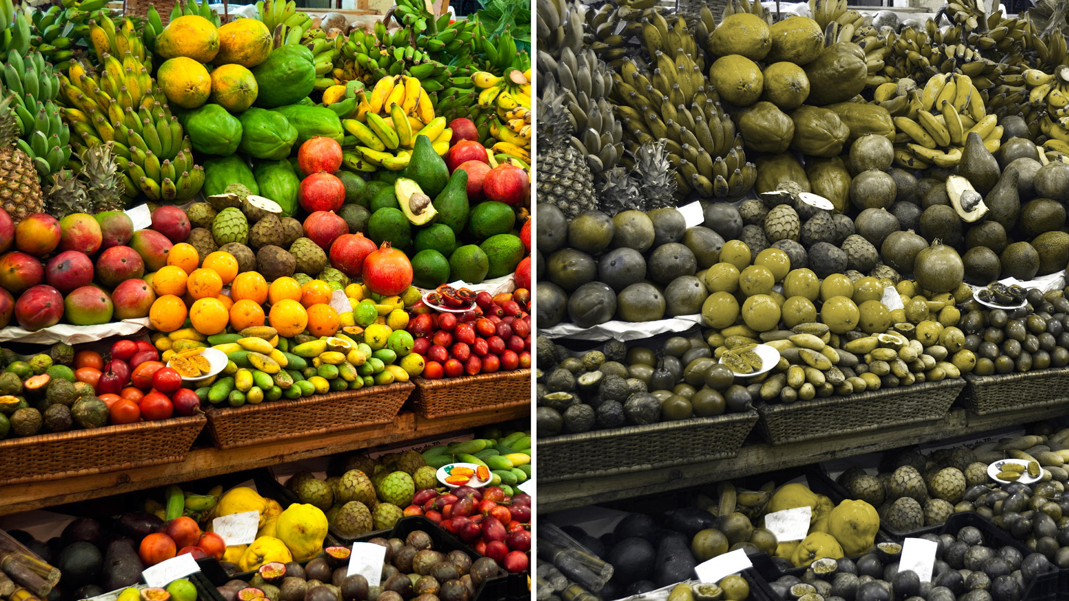
Six years ago, a couple discovered a possible cure for colorblindness. Typically, colorblindness is genetic, so gene therapy is a possible cure for it. Eight percent of men are affected by it, while only 0.5% of women are. What happens is, a mutation on the x-chromosome inhibits distinguishing abilities between red and green. While red and green are just two colors in our spectrum, the way that colors are made and the way we see them means that reds and greens within other colors like blue, purple, orange, and yellow are also affected. Look below at the simulation.

As we learned in class last week, monkeys have the most similar experience with viewing color that humans do, and so that’s just what the two scientists used: squirrel monkeys. First, they began with surgery on the monkeys’ retinas, where new genes must be inserted in order for cells to respond to color. However, retinal surgery is risky. Other scientists at Berkeley discovered an alternative way to deliver the genes, which is through the vitreous, which is the clear gel in the eye. Somehow, this has nothing to do with the cones in the brain, but instead is only within the eye.

Posted in Uncategorized | 3 Comments

Other Applications of the Principles of Color Constancy

This week we learned about a concept that our readings call “color constancy.” I find this absolutely fascinating, because it changes the way we define color completely. Normally, one might claim that an object’s color can be measured by the wavelengths of light that it reflects back to our eyes. However, we saw very clearly from the optical illusions that Prof. Conway showed us in class that the way we label colors depends on more than the wavelength of light being physically reflected. It also depends on the colors surrounding the point we are trying to define; specifically, it depends heavily on the color of the illuminant.

As discussed, our brain recognizes that the light illuminating a scene has a certain color to it, and uses this knowledge to figure out what the scene would look like under white light. That way we can recognize objects under any kind of lighting; for instance, we know a red apple is red regardless of whether it’s physically reflecting the wavelengths available from white light, blue light, or any other color of illuminant.

I found it interesting that this subconscious pattern in our brain is very similar to how many scientific instruments are designed. Essentially, our brains are subtracting the background so that we can see only the significant data. This is how zeroing a scale works: if there is nothing sitting on the scale and you zero it, then add 1 g, the scale tells you there is 1 g present. If you put 5 g on the scale, then zero it, then add 1 g, the scale will still tell you there is only 1 g present. Zeroing the scale to take into account what was already there is just like our brain “zeroing” the color of the illuminant to take into account that there was already a color present before the object of interest came into the picture.

Another example is GC-MS data, which stands for Gas Chromatography and Mass Spectrometry. The GC part of the equipment separates a solution into the individual parts that were dissolved in it, much like the syringe in our kool-aid experiment from our first lesson on color. The MS equipment reads the masses of the substances coming out of the GC equipment. When looking at the MS data for the particular component you’re interested in, one has to subtract the background MS readings first. This is because the solution your stuff of interest was dissolved in also has a certain set of masses associated with it. If you get the MS reading without subtracting the background from the solution, you’re not actually reading data on your stuff of interest. You’re reading data on the stuff and the environment it’s currently in, much like without our brain’s calculations we would see the color of an object as altered by a colored illuminant. This information is useless, because you can’t tell if the readings are actually caused by your stuff of interest or not. If you subtract the background MS data, then you now have useful, relevant information (data for the stuff itself), just like how our brain’s calculations give us useful information (what the object’s color is regardless of illuminant).

I would assume these instruments were designed independently of findings on how our brain interprets color, so it is interesting that this incredibly useful system for analyzing information came to exist in different scenarios and in different ways. Apparently the need to dismiss background information in order to obtain relevant information is indeed that basic and universal.

Posted in Uncategorized | Leave a comment