
 Here is almost all you need to know about the course I took at the the University of Virginia’s Rare Book School (RBS) last summer: the instructor designed and set the type for a 28-page supplement to his course pamphlet, a transcription and partial translation of a 1693 French text describing the type-casting process. He was not fooling around.
I learned about the Rare Book School through the happy graces of Katherine Ruffin, Book Arts Program Director, and Amanda Nelsen, a visiting artist at the Book Arts Lab in 2010 and now RBS’s Program Director (and also a member of the class I took). They encouraged me to apply for the RBS Scholarship, which allows the recipient to enroll in any RBS class in a given two-year period. So I found myself in steamy Charlottesville, Virginia, in the summer of 2011, wondering about this stuff called “grits” and taking James Mosley’s week-long seminar called Type, Lettering & Calligraphy from 1450 to 1830.
Mr. Mosley, a fearsomely erudite member of the typographical elite, walked us through the minutiae of letterforms, from Etruscan tablets and late medieval manuscripts to linotype and the advent of digital design (course title be damned). Much of the content we discussed during the week’s lectures can be found in detail on his blog–http://typefoundry.blogspot.com–which also includes many of the reproductions he used. Some aspects of the class, I regret, are untranslatable to the digital sphere, such as the afternoon we spent watching Mr. Mosley hand-cast a reproduction of an “a” from the 42-line Gutenberg Bible, casually tossing molten metal from hand to hand using a traditional wooden and wire mould.
Following documentaries on punch-carving, matrix-casting, and mould-making, the casting demonstration showed, literally, how these pieces fit together. An alloy of lead, tin, and antimony is ladled into the mould, which contains an inverse form, or “matrix,” of the desired sort; the mould is then given a few shakes, with a debonair flourish of the wrist, to encourage diplomatic relations between metal and matrix. The new sort, once cool, is ejected from the mould, ready to use once the “jet,” a vestigial metal tail, is snapped off.
As someone who claims familiarity with type anatomy, observing a piece of type cast and seeing its inverse relationships with the matrix and mould finally taught me how, and why, the architecture of nicks, grooves, and planes come together where they do. “Type,” quoth Harry Carter, “is something you can pick up and hold in your hand.” It is a physical object whose spatial history has to be physically understood before it makes any sense. My weighty silver “a”–Mr. Mosley made one for each of us–boasts the cascading undulations unique to hand-cast metal: the signature of how the molten liquid washed down the side of the mould.
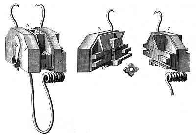
A mould illustrated in Jacques Jaugeon’s ‘Description des Arts et Métiers’, 1693. Mr. Mosley’s useful description, from his blog: “The closed mould is on the left, with the bottom end of the matrix, to which a piece of leather has been tied, projecting from it. The image in the centre shows the other end of the matrix, with a piece of cast type, with its nick ‘on top’ and the projecting ‘jet’ of surplus metal, still in place.”
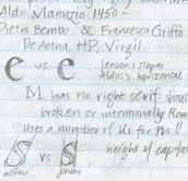
Other gems of the week’s intensive lectures included a précis of the distinctions between the typesetting of pioneering 15th-century printers Jensen and Aldus (the key is in the angle of the crossbar of the “e”), and a discussion of the political dimensions of typography in the French and American Revolutions. In France, opposing sides co-opted enemy type to produce misleading broadsides; American printers chose to use Scottish–rather than English–type for revolutionary documents, including the Declaration of Independence.

This week of 9-to-5 lectures was fast-paced (a century a day?) and dedicated to obsessive nit-picking (a family tree of the hundreds of different “a”s in that 42-line Bible?!), but despite its intensity, Mr. Mosley clearly only skimmed the surface of his preparations and oceanic depth of knowledge. I think his intent was to push us off the end of the typographic dock, so to speak, so that in floundering we might learn to swim. The real intent, I fathom, was to provide us with the resources and awareness to continue exploring the 40,000 leagues under the “c” (as it were). To switch metaphors, Mr. Mosley told us that “recognizing type is like recognizing birds”: even with a field guide in hand, distinguishing the flight patterns and underwing markings of interrelated species clearly requires a lifetime of field work, study, and dissection behind it. And speaking of birds: in case any ornithologists are keen to turn orthographer, we learned that the best feathers for a quill pen are the first four flight feathers on a bird’s left side. Either a goose (Anatidae) or a turkey (Meleagridae) will do nicely.
Taking this class was a remarkable opportunity and privilege, and in addition to Mr Mosley’s exacting tutelage, I am grateful to Katherine for supporting my application, to Amanda for graciously hosting me at her home in Charlottesville for the week, and to the RBS for granting my scholarship, without each of which I should never have been able to attend.
Genevieve Goldleaf ’12 is a double major in Medieval and Renaissance Studies and Environmental Studies and is a student employee in the Book Arts Lab.