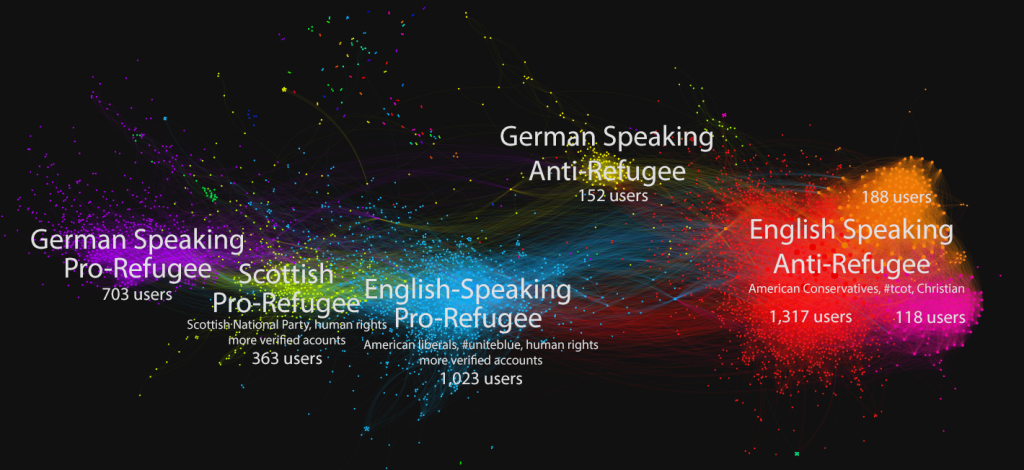
Since the Paris attacks in November, 2015, social media has become increasingly polarized and emotional when it comes to discussing the refugee crises. On the 18th, the hashtag #RefugeesWelcome was trending on Twitter in the US. The co-retweeted network visualizes just how polarized and international the debate is.

On the left are three pro-refugee groups, differentiated by language and location. The purple group is largely German; the green are Scottish, many identifying with the Scottish National Party; and the blue are American liberals. On the right are four groups spreading anti-refugee messages. In yellow, another group of Germans; the red, orange and pink groups are all English speaking, mostly American, with similar messages and identifying themselves with terms like #tcot and “christian.”
The co-retweeted network graph is interactive on TwitterTrails, and includes a widget below the graph where you can view aggregated statistics on each group, including user languages, most used words in descriptions and most used hashtags.
You can explore this network on TwitterTrails:
http://twittertrails.wellesley.edu/~trails/stories/investigate.php?id=984767780
Comparison with past usage
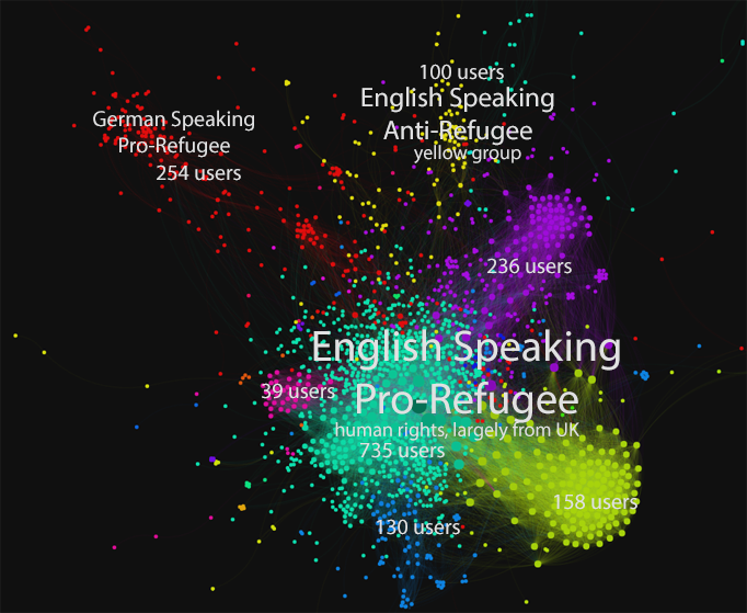
#RefugeesWelcome was also trending on September 3rd, in reaction to the images of the body of a drowned Syrian toddler, Alyan Kurdi, washed up on a Turkish beach. At this time, the network was not polarized, and although there are different groups shown they are mainly spreading the pro-refugee message.
The users are mostly English speaking, from the UK, though there is a group of German users as well (in red). The anti-refugee group, shown in yellow, is much smaller and less dense than the group from 11/18.

More on the 11/18/2015 usage
On TwitterTrails, you can color the co-retweeted network by user language, revealing the language separation of the 11/18 network:
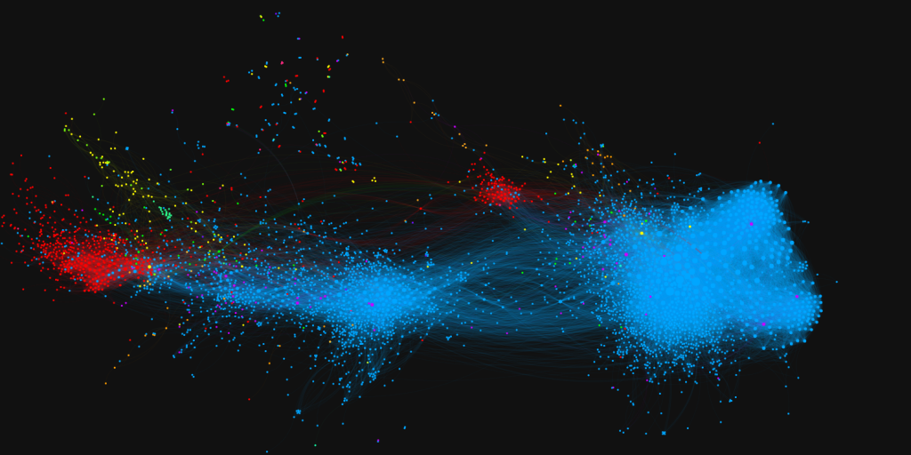
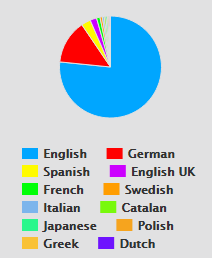
Most of the users are English speaking, but there are also a large number of German users. The top user languages are shown in the pie chart in the statistics view, displayed to the left. The colors in the pie chart match those in the partitioned graph.
You can also differentiate the verified and unverified accounts in the network. The verified accounts are shown in blue.
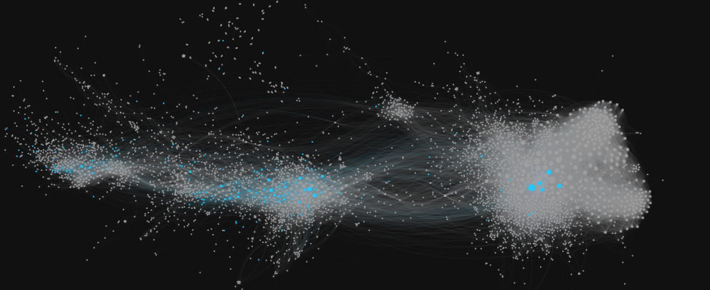
Overall the network has about 4% verified accounts, though the pro-refugee groups have higher distributions of those accounts. The anti-refugee groups combined are less than 1% verified, while the pro-refugee groups average around 6% verified accounts. Although there are plenty of politicians with anti-refugee stances, they are not influential (if engaged at all) in the #RefugeesWelcome discussion.
You can explore both stories on TwitterTrails:
9/3/2015: http://twittertrails.wellesley.edu/~trails/stories/investigate.php?id=777606840
11/18/2015: http://twittertrails.wellesley.edu/~trails/stories/investigate.php?id=984767780
Would you like to analyze the network yourself? The network graphs are also uploaded on our figshare: 9/3/2015 and 11/18/2015.
